Page 80 - Module_4_en
P. 80
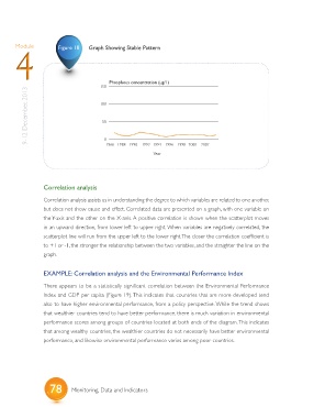
Module           Figure 18   Graph Showing Stable Pattern
       4


                                            Phosphous concentration (ug/1)
                                        150
            9-12 December, 2013         100


                                         50


                                          0
                                                        1992
                                                             1994 1996
                                          1966 1988
                                                   1990
                                                             Year     1998 2000  2002


                  Correlation analysis

                  Correlation analysis assists us in understanding the degree to which variables are related to one another,

                  but does not show cause and effect. Correlated data are presented on a graph, with one variable on
                  the Y-axis and the other on the X-axis. A positive correlation is shown when the scatterplot moves
                  in an upward direction, from lower left to upper right. When variables are negatively correlated, the
                  scatterplot line will run from the upper left to the lower right. The closer the correlation coefficient is
                  to +1 or -1, the stronger the relationship between the two variables, and the straighter the line on the

                  graph.


                  EXAMPLE: Correlation analysis and the Environmental Performance Index

                  There appears to be a statistically significant correlation between the Environmental Performance
                  Index and GDP per capita (Figure 19). This indicates that countries that are more developed tend

                  also to have higher environmental performance, from a policy perspective. While the trend shows
                  that wealthier countries tend to have better performance, there is much variation in environmental
                  performance scores among groups of countries located at both ends of the diagram. This indicates
                  that among wealthy countries, the wealthier countries do not necessarily have better environmental
                  performance, and likewise environmental performance varies among poor countries.


                    78       Monitoring, Data and Indicators

