Page 36 - Module_7_en
P. 36
Module
       7               with one computer per group. If that is not feasible, the exercise can be conducted with


                       pens and paper. Following the two examples below, participants should improve graphical
                       presentation through:

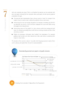
                          ?  Choosing the best representation (bars, columns, points or lines). For example, if the
            9-12 December, 2013    ?  Harmonizing font and size through all graphics. For example, considering that the font
                          subject concerns volume (cubic metres), the preferred choice may be bars.


                          size describes the priority of the information displayed, font size should differ among
                          title, legends and measurements.
                          Harmonizing colours of the graphic (i.e., bars, columns, points, lines, background, grid
                          ?
                          lines).  For example, associating colours with themes, choosing contrasts and other visual
                          elements, as needed.

                          ?  Delete all  unnecessary information  that  “pollutes” the presentation. For example,
                          gridlines, chart borders and other elements are often used without considering their
                          impact on visual clarity.


                       The duration of the exercise is about 1 hour, after which all groups present results of their
                       work in plenary, and explain their choices for visual presentation.


                        Example      Automatically generated excel graphic and graphic elements


                                          Total Caspian Caviar Export and Quotas           Chart title
                                         300                                               Chart title border
                                                                                           Chart border
                                         250                                               Chart area
                    y-axis (value axis)
                                         200                                               Data series
                                         150                                               Gridlines
                    Unit (y) axis title
                                         100
                                                                                           Data plot area
                        y-axis value      50
                                                                                           Plot border
                                           0
                                               1999    2000    2001    2002   2003         x-axis value
                                                               Year                        x-axis (category axis)

                                                 Reported                                  Legend
                                                 Quotas                                    Legend border


                    34       Creating Communication Outputs from the Assessment

